Improved Usability and New DORA Metrics Template

We are listening Transformation Leaders! We have new designs and ease-of-use features available today to enable you to demonstrate progress and drive clarity of the current state with your stakeholders. Here is to measuring transformation and making your lives easier :)
Assessment Templates Redesign
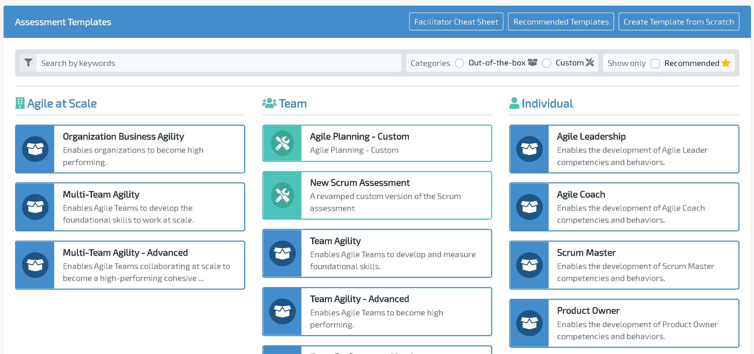
The most in-your-face part of this release. The Assessment Templates launching page has been redesigned with new features including a new card design, filtering, and recommended templates.

|
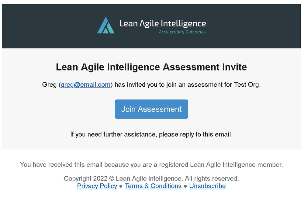
In addition to a new design, there is an Unsubscribe link in the email that provides a shortcut to the Account screen where members can opt out of two types of emails - Assessment Reminder and Marketing emails. |
Self-Assessment Platform Improvements
The self-assessment platform has many minor improvements that change the experience.

-
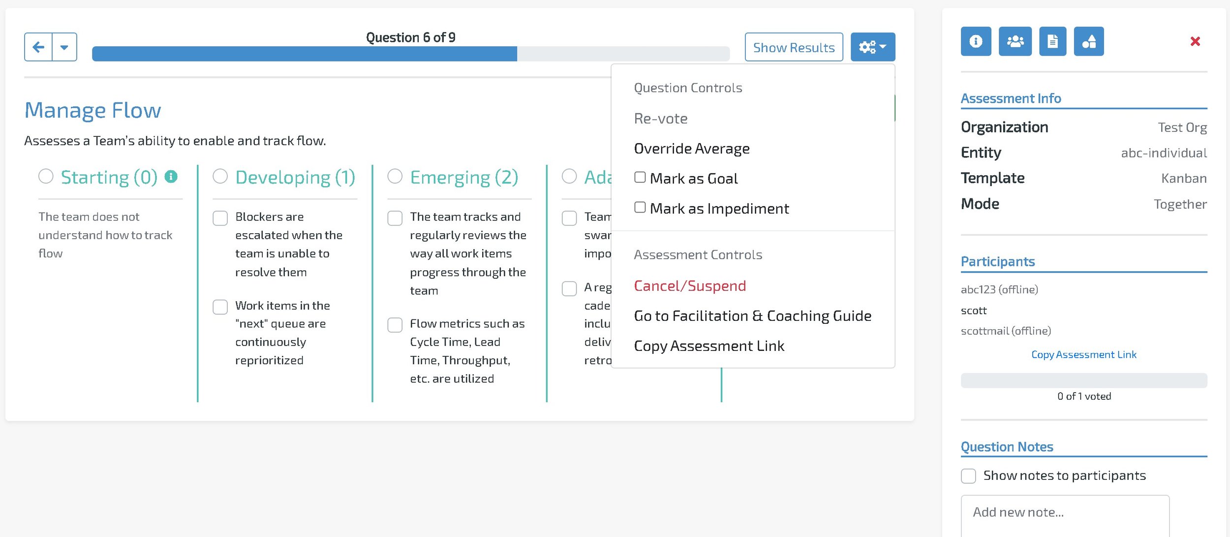
The assessment controls have been moved from the top of the screen into the cog menu (see above). This creates more space for voting and managing the assessment.
-
The “How to Vote” instructions have been moved from the sidebar to a button next to “Submit Vote”.
-
The sidebar is open by default for facilitators and docked by default for non-facilitators.
-
During Assessment Launch, the Copy Link action copies the link plus instructions.
-
Participant-only users cannot join an assessment using an email of a registered member. This prevents registered members from joining the assessment incorrectly.
New DORA Metrics Template
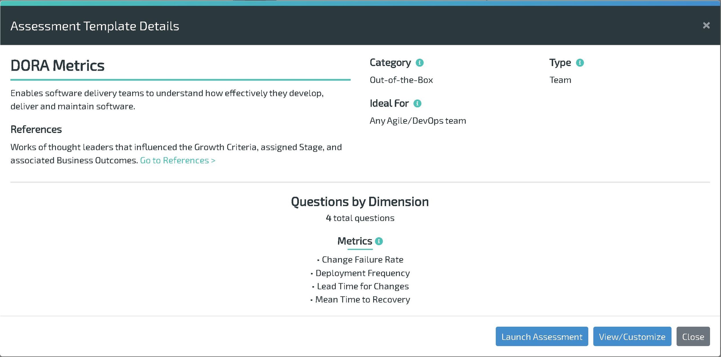
Our latest Out-of-the-Box assessment template takes our Metrics questions and gears them specifically towards DORA Metrics. Check it out in the Assessment Templates screen today.

 Email Redesign